Brand identity design
Stacy Newbright & Ella Mallord
Beauty & Skincare
30 hours
Brand Strategist & Designer
This was the first creative brief I tackled during my course, developed with direct feedback from an experienced UX/UI instructor. The goal was to craft a cohesive and empathetic brand identity for a customizable beauty and skincare company. The brand needed to resonate with individuals seeking natural, personalized solutions for sensitive skin—emphasizing relief, confidence, and natural beauty without clinical overtones.
- Brand Strategy Development
- Logo and Visual Identity Design
-Packaging Design
-Responsive Website Design
- Comprehensive Brand Guidelines
- Logo
- Packaging Mockups
- Desktop and Mobile Website Designs
When I started working on this project, I didn't have formal research to lean on. So, I turned to mood boards to set the visual and emotional tone for the brand. I gathered images, color palettes, typography, and textures that resonated with the natural, personalized skincare experience we aimed to create. These boards became my main references, guiding me through the design process and ensure consistency in the brand's look and feel. They served as a visual reminder of the aesthetic and emotional direction I wanted to maintain, helping me stay aligned with the brand's values and the needs of its target audience.
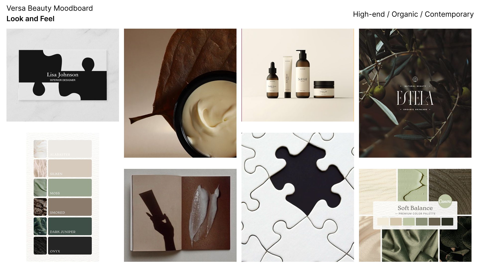
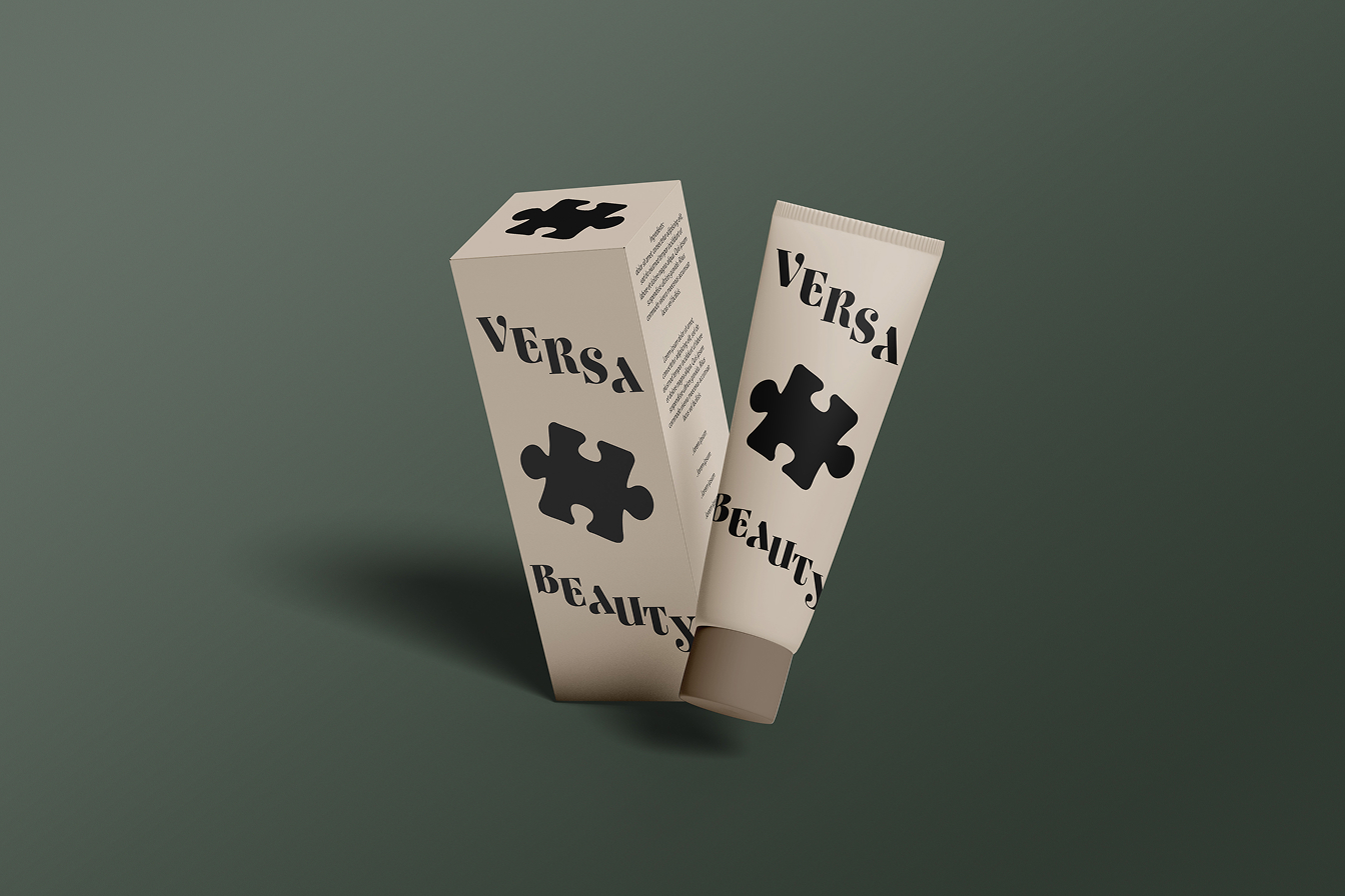
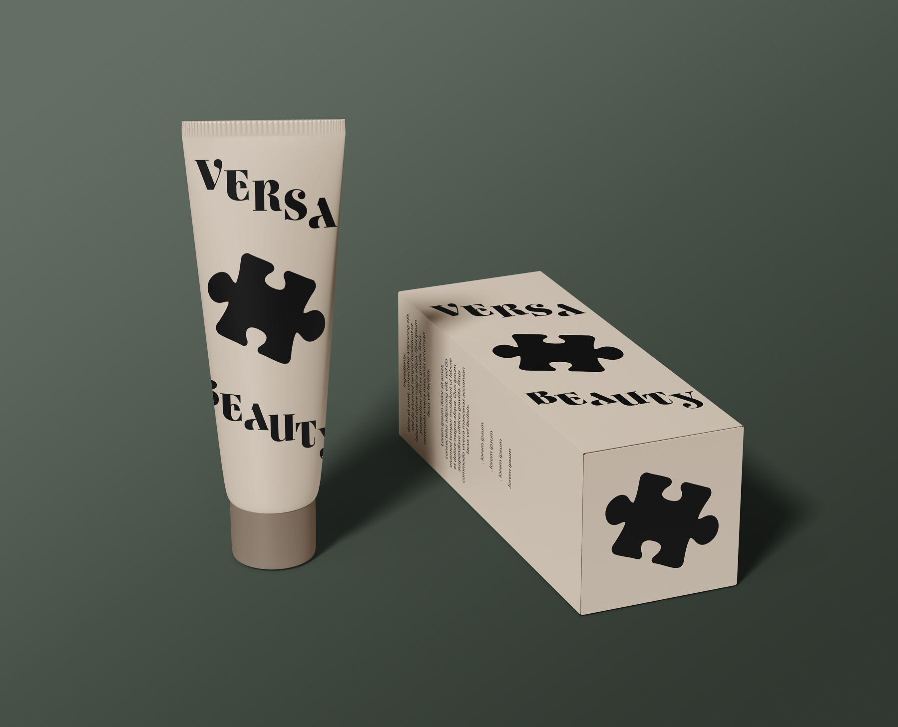
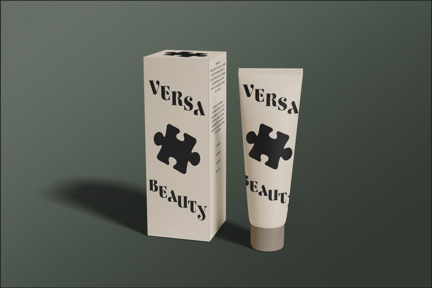
I was really fascinated with the idea that this brand was the "missing piece" to your skincare needs. I loved the idea of adding a puzzle piece into the final design or logo to really drive that point forward. I wanted flowy organic lettering to be apart of the design to solidify the clean, organic feel of the brand. Natural earthy colors were chosen for the same reasons.
This brand is all about creating personalized skincare solutions for individuals with sensitive skin, focusing on providing relief and boosting confidence rather than offering clinical treatments. The aim is to develop a skincare line that feels approachable and empowering, helping users feel comfortable and confident in their own skin.
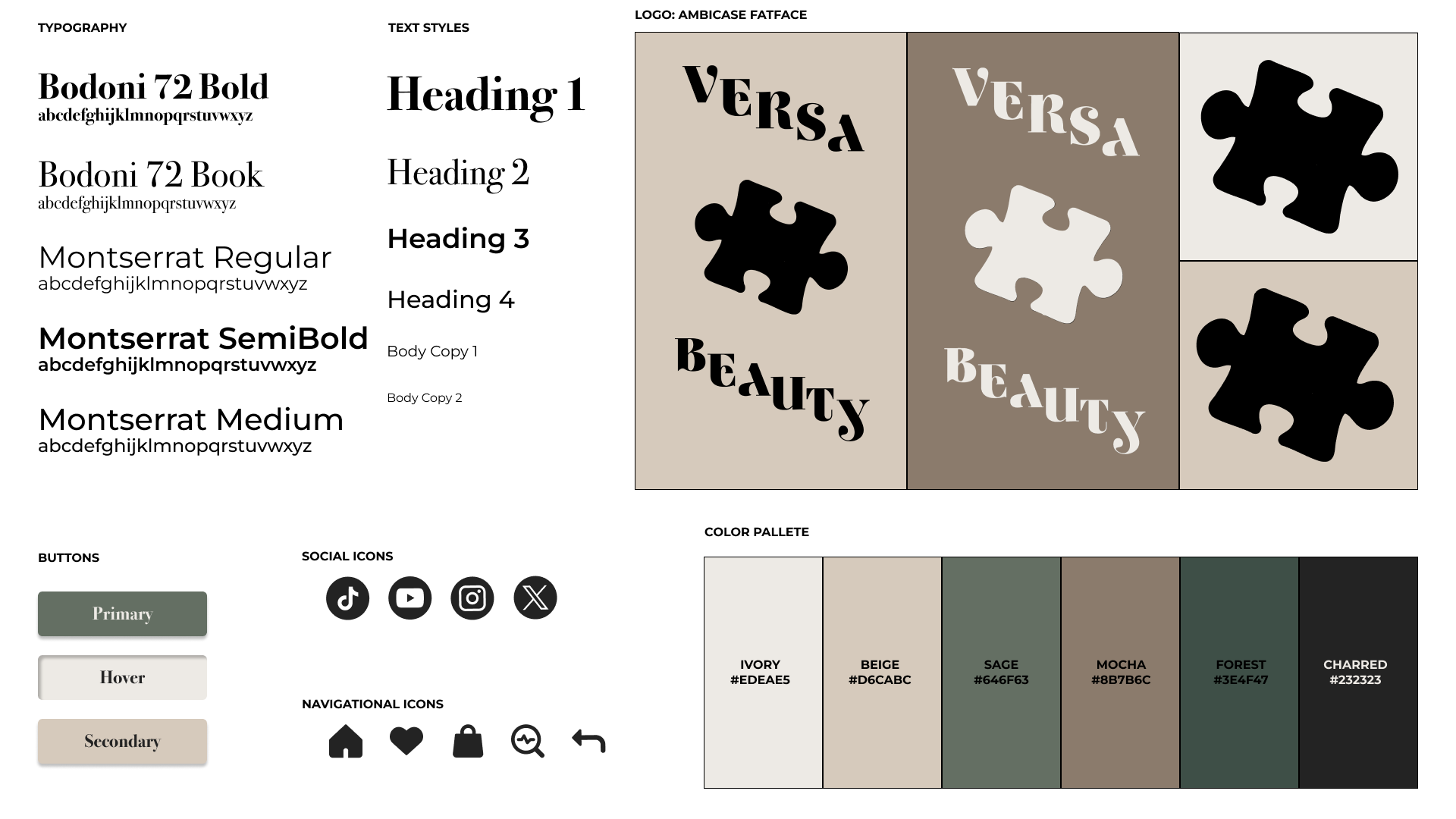
Logo-
The logo is simple with organic curvatures in the typeface. The ends of some of the letterings also look very similar to the edges of puzzle pieces, further solidifying that theme. The curvature leans well into the organic, clean feel the brand is shooting for. I designed the logo at a slant to give the illusion of wrapping around packaging, encouraging the reader to read the whole bottle.
Color Palette-
An array of browns and greens strengthen the organic component of the brand, giving a woody vibe and contemporary feel.
Typography-
A fun stylized font is used for the heading. I chose this because it is a more toned-down and easier-to-read version of the very stylized logo. A wide sans serif is used for body copy and smaller headings to further help with legibility for our wider age range target audience.
I wanted to keep the packaging simple and sleek, while still preserving the organic feel. To achieve this, I used the ivory color in the style guide as the base for the products. The logo being on a slant slightly wraps around the tubes encouraging your eye to follow. Staying true to the branding, I added a puzzle piece from the logo to the top of the box serving as a symbol for the brand itself.
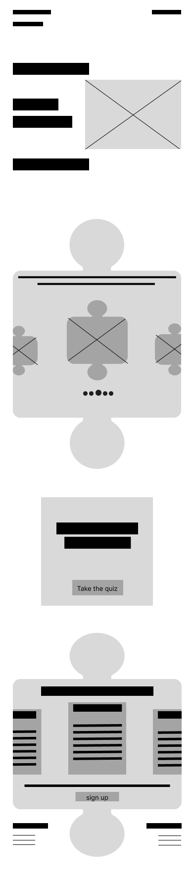
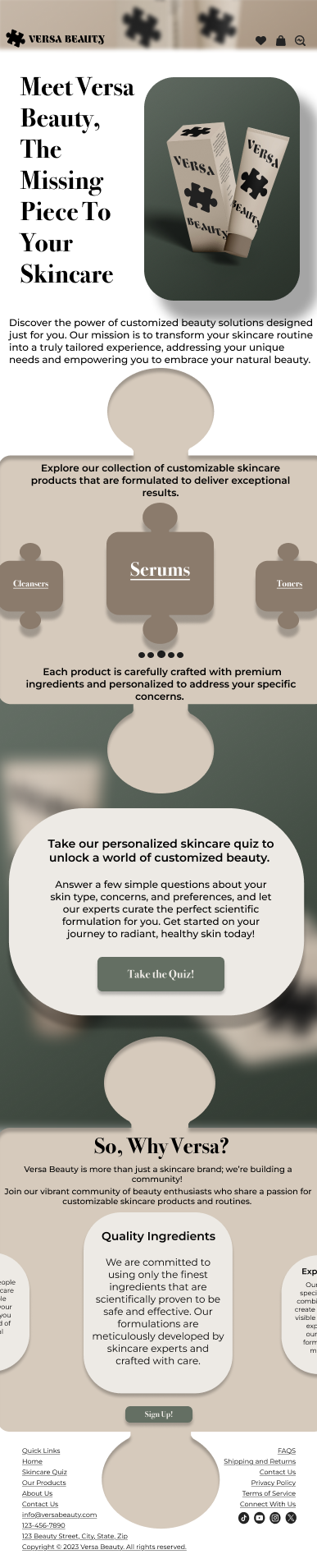
I wanted the homepage to feel cohesive and thoughtfully connected, so I designed each section to fit together like pieces of a puzzle. You can see this in the wireframes — I spent a lot of time shaping the layout to create a puzzle-like structure that still supported a smooth, intuitive user experience. Balancing that visual concept with usability was a challenge, but with feedback from my instructor, it came together in a way I’m proud of. To enhance the puzzle effect, I used inner and outer shadows for a subtle, "pushed-in" feel. I followed a 2:1 grid ratio for both desktop and mobile, and added carousels on mobile to keep navigation clear and user-friendly.


Wrapping up this project, I found it to be a valuable exercise in applying design principles within a structured framework. Even though the brief was hypothetical, it provided an opportunity to explore user-centered design strategies and develop a cohesive visual identity. This experience reinforced the importance of adaptability and critical thinking in the design process. Moving forward, the insights gained here will inform future projects, particularly in balancing aesthetic considerations with user needs.
