- UX/UI Designer
- User Researcher
- Information Architect
- Visual Designer
- Figma
- Notion
- Adobe Illustrator
This project was part of my UX/UI design course, where I responded to a professional-style creative brief. The task was to design a responsive website for a fictional pharmaceutical company specializing in allergy treatments. The goal was to create a site that educates patients, conveys the company's values, and serves as a trusted resource for doctors and digital marketing campaigns. Throughout the project, I received ongoing feedback from an instructor with industry experience, simulating a real-world client-designer relationship.
Pharmaceutical websites often come across as sterile and overwhelming, prioritizing dense medical information over a positive user experience. This project challenged me to break away from that traditional clinical feel and create a warm, approachable design. The goal was to clearly communicate scientific credibility and product safety to a broad audience of patients aged 35–65 and healthcare professionals, while ensuring the site feels inviting and user-friendly.
- 28-hour timeline from ideation to final mockups
- Responsive design specs for desktop (1440px width) and iPhone 14 Pro (393px width)
- Guided by a detailed creative brief and evaluated by an experienced UX/UI instructor
While I didn't conduct a formal competitor analysis, I spent time exploring various pharmaceutical websites to understand their design approaches. Sites like Pfizer and Johnson & Johnson had a professional yet very clinical feel, with limited call-to-action buttons and unclear hierarchy. AbbVie's website stood out with a more colorful and engaging design, which was much more appealing. This exploration highlighted an opportunity to incorporate calming tones and reorganize information to create a more approachable and an easy to navigate experience for our target age range.
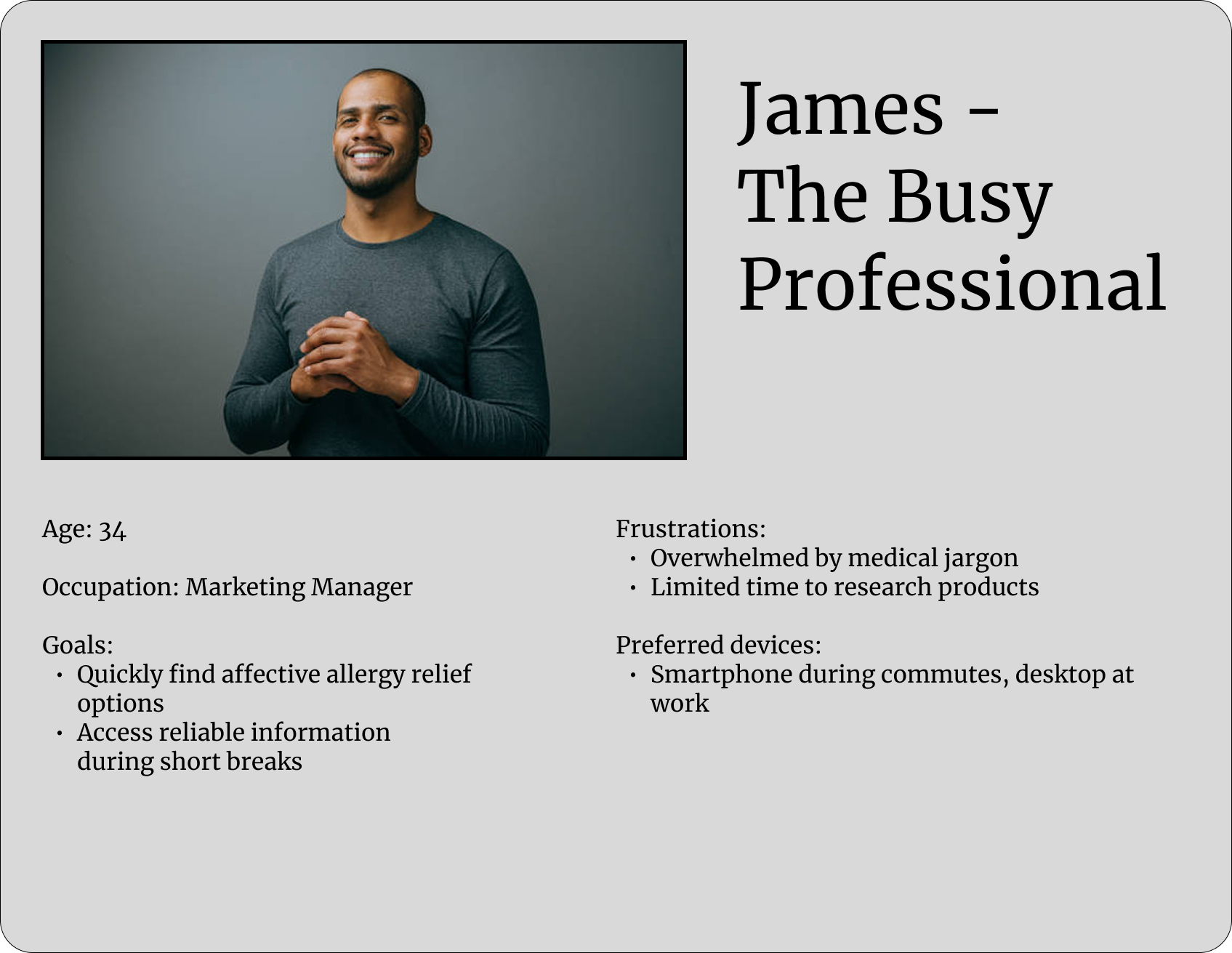

I created two personas—James and Linda—to anchor the design process and keep the focus on accessibility and tone. James represents a tech-savvy individual seeking reliable health information, while Linda embodies a user who values clarity and ease of navigation. By keeping their needs and preferences in mind, I aimed to design wireframes and high-fidelity prototypes that are intuitive and approachable. These personas served as constant reminders to prioritize user experience, ensuring that the design remains user-centered and accessible to a broad audience.
With the research and personas in mind, I began developing low-fidelity wireframes to plan the layout. These wireframes served as a blueprint, allowing me to visualize the information hierarchy and create an easy-to-navigate design. The focus was on clarity, accessibility, and straightforward navigation, making sure users could find what they needed without feeling overwhelmed. I kept the wireframes intentionally simple, using grayscale elements and placeholders to map out the structure without getting bogged down in visual details. This approach made it easier to iterate quickly and focus on the user flow and functionality. For easy viewing, please click on the images below. While they are split into sections, the actual wireframe is one continuous page designed for scrolling.
I wanted to keep the blocks of texts to around 7 words per line for readability and a 2:1 ratio between desktop and mobile for responsive design. The main feedback I received was to ensure spacing was consistent throughout, especially for text, and using rulers to keep the alignment of elements in check.
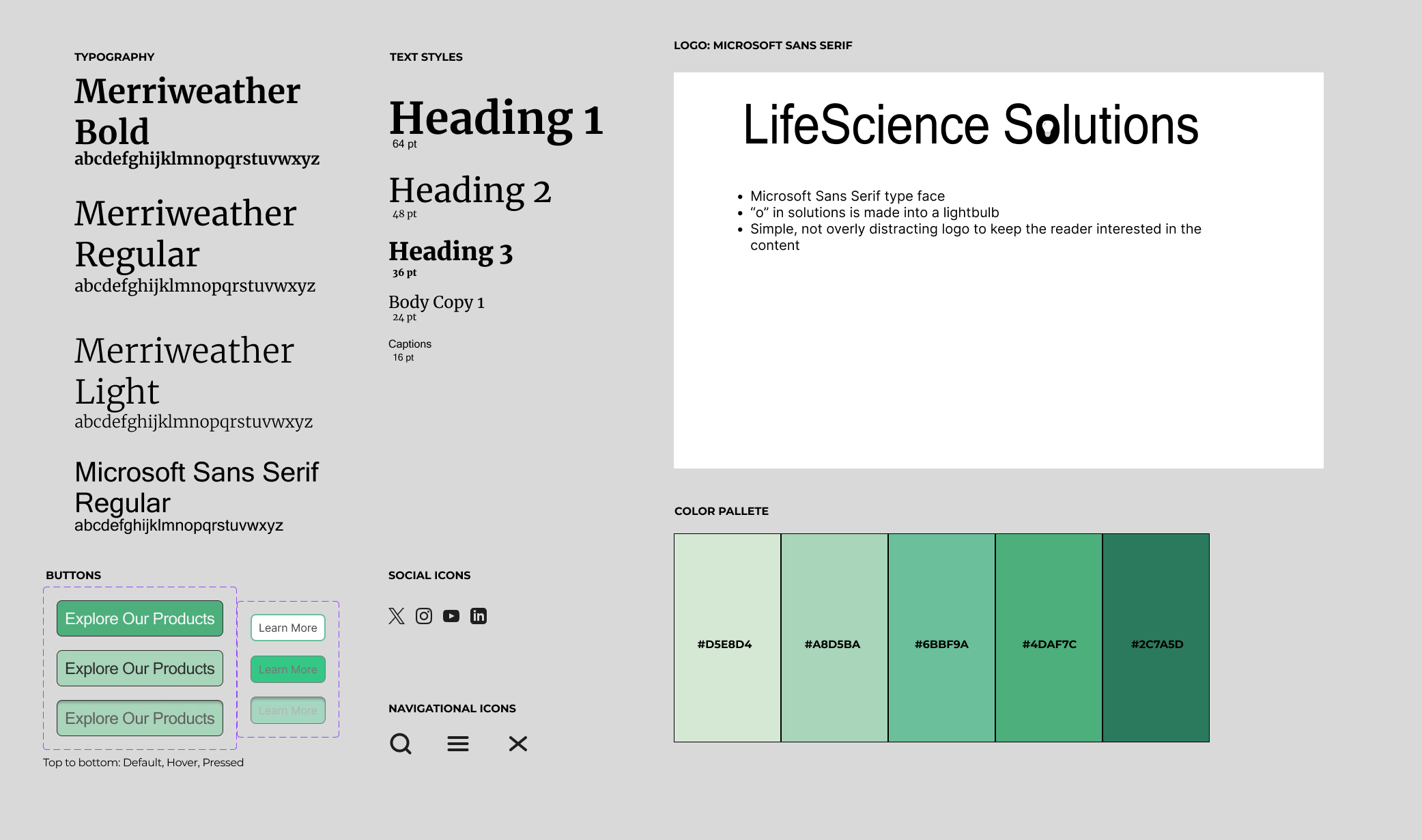
To create a less clinical feel, I kept a monochrome pallette of soft inviting greens and teals that still simulate trust while also portraying calmness and vitality.
A sans serif for the body text was to establish easy readability for our target demographic, and ensuring no font size is below 16 px.
UI elements such as buttons and cards were designed with rounded edges and high contrast for clarity and accessibility. Icons are minimal but friendly, helping guide users without overwhelming them.
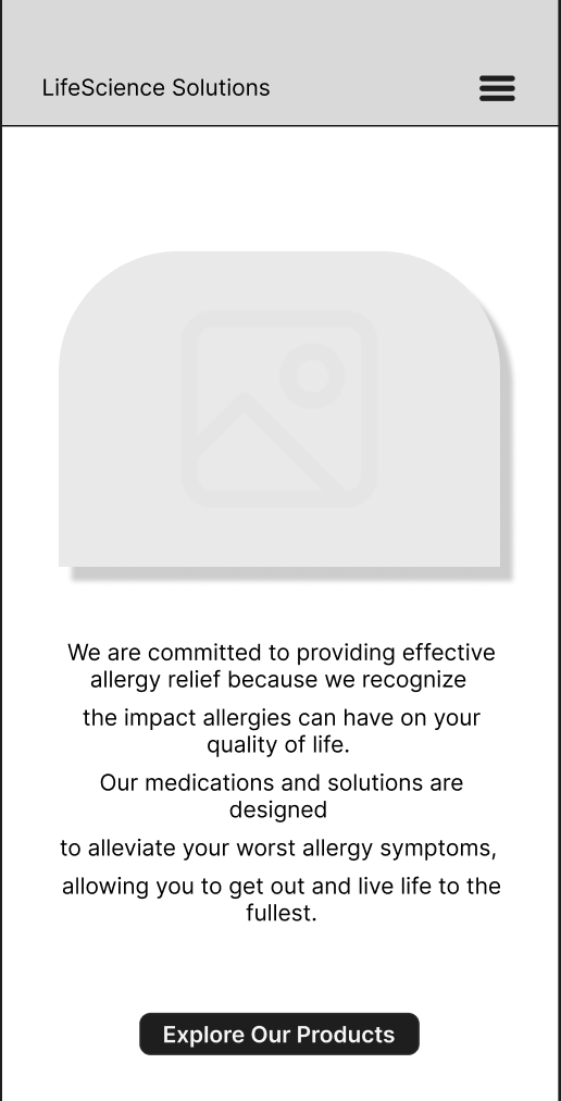
After finalizing the structure with wireframes and setting the visual direction through the style guide, I moved on to crafting the high-fidelity mockups for both desktop and mobile. This phase was about bringing everything together—usability, aesthetics, and brand personality—to create a cohesive and polished digital experience. I focused on making sure that the design felt intuitive and approachable, aligning with the needs and preferences of our target users.
For the desktop version, I aimed to create a clean and intuitive layout that feels welcoming rather than clinical. I designed two distinct button styles: one for primary calls-to-action and another for product-specific interactions, making navigation straightforward for users. To add a touch of personality and break away from a purely clinical feel, I introduced a custom SVG illustration of glasses in the "Our Vision" section. Rounded top corners on images contribute to a friendly and approachable aesthetic. Additionally, I implemented a sticky navigation bar to allow users to have constant access to key sections as they scroll.
Designing for mobile meant rethinking how everything would feel on a smaller screen. I kept the button styles consistent with the desktop version but ensured they were optimized for touch—big enough to tap without frustration. To maintain text readability over images without compromising visual appeal, I applied blurred white overlays beneath textual content, preserving whitespace and preventing visual clutter. The custom SVG illustration and rounded image corners were retained to maintain brand consistency. Additionally, I implemented a sticky navigation bar to ensure users have constant access to key sections as they scroll.
After receiving feedback from my instructor, I revisited the design with fresh eyes. We discussed each suggestion in detail, allowing me to refine the layout and interactions thoughtfully. This collaborative process helped me align the final design more closely with the original problem statement. I believe James and Linda would appreciate the improvements made to enhance their user experience.
This case study shows the kind of user-focused design I try to bring to every project. While I didn’t do formal usability testing, all my decisions were based on research and feedback-driven changes. Looking ahead, I’m excited to apply what I’ve learned in more collaborative settings and keep improving my design process.
Even though this project was part of a guided course, I treated it like a real client project — balancing vision, feedback, and user needs. It gave me a solid foundation for how I approach responsive, research-based design. I’m excited to take this experience forward and dive into real-world projects to keep building and testing my skills.