- UX/UI Designer
- User Researcher
- Information Architect
- Visual Designer
- Figma
- Notion
- Adobe Illustrator
BitSavvy is a conceptual mobile application designed to make cryptocurrency investing approachable for beginners. Recognizing that many existing platforms can be overwhelming for newcomers, BitSavvy integrates educational modules with investment features, allowing users to learn and invest at their own pace. The app aims to provide a clean, intuitive interface that resonates with Gen Z and Millennials, fostering confidence and transparency in the crypto investment process.
Navigating the world of cryptocurrency can be overwhelming, especially for newcomers. Many existing platforms are cluttered with complex interfaces and assume a level of prior knowledge that beginners simply don't have. This often leaves users feeling lost and discouraged, with no clear path to understanding or investing confidently. There's a clear need for a platform that demystifies crypto, offering straightforward education and guidance tailored for those just starting out.
Timeframe: A total of 23 hours allocated for research, ideation, wireframing, high-fidelity design, and final polishing.
Platform: Design tailored for iPhone 14 Pro specifications (1179px × 2556px).
Target Audience:
Younger demographic (18–30 years old) with limited crypto experience but familiarity with mobile apps and social media.
Design Requirements:
Create a clean, contemporary interface that appeals to Gen Z and Millennials without resorting to overused generational stereotypes.
Deliverables: Comprehensive style guide, demographic and competitor research, user journey map, user flow diagrams, wireframes, and high-fidelity designs of 3–4 key screens.
To understand where BitSavvy could stand out, I analyzed the top crypto apps on the market using a SWOT analysis. I gathered a range of 5-star and 1-star reviews for each one to identify common patterns in what users loved — and what frustrated them. While some apps had strong features, like clean dashboards or advanced tools, users frequently mentioned issues with unreliable support, high subscription costs, and crashes during big transactions. I also took my own experience into account — as someone new to crypto, I found the top apps almost indistinguishable in design and overwhelming to navigate. Without a solid knowledge base, it was easy to feel lost. This research helped clarify what BitSavvy needed to do differently: keep things intuitive, supportive, and beginner-friendly.

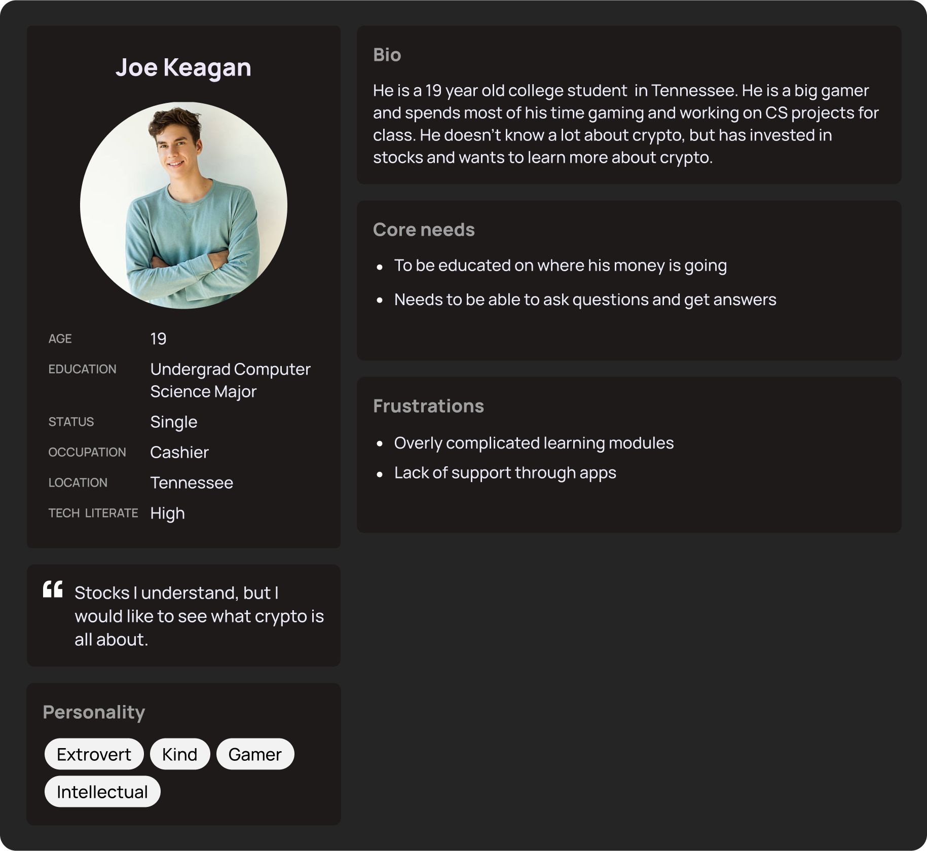
I created two Gen Z/ Millennial personas. Both tech savvy and open about their finances. I determined the core needs were to be educated on investing in crypto and being able to get help whenever needed. My goal was to find a solution to their needs. I crafted a User Jpurney chart that takes a user from finding the app all the way to the support section.

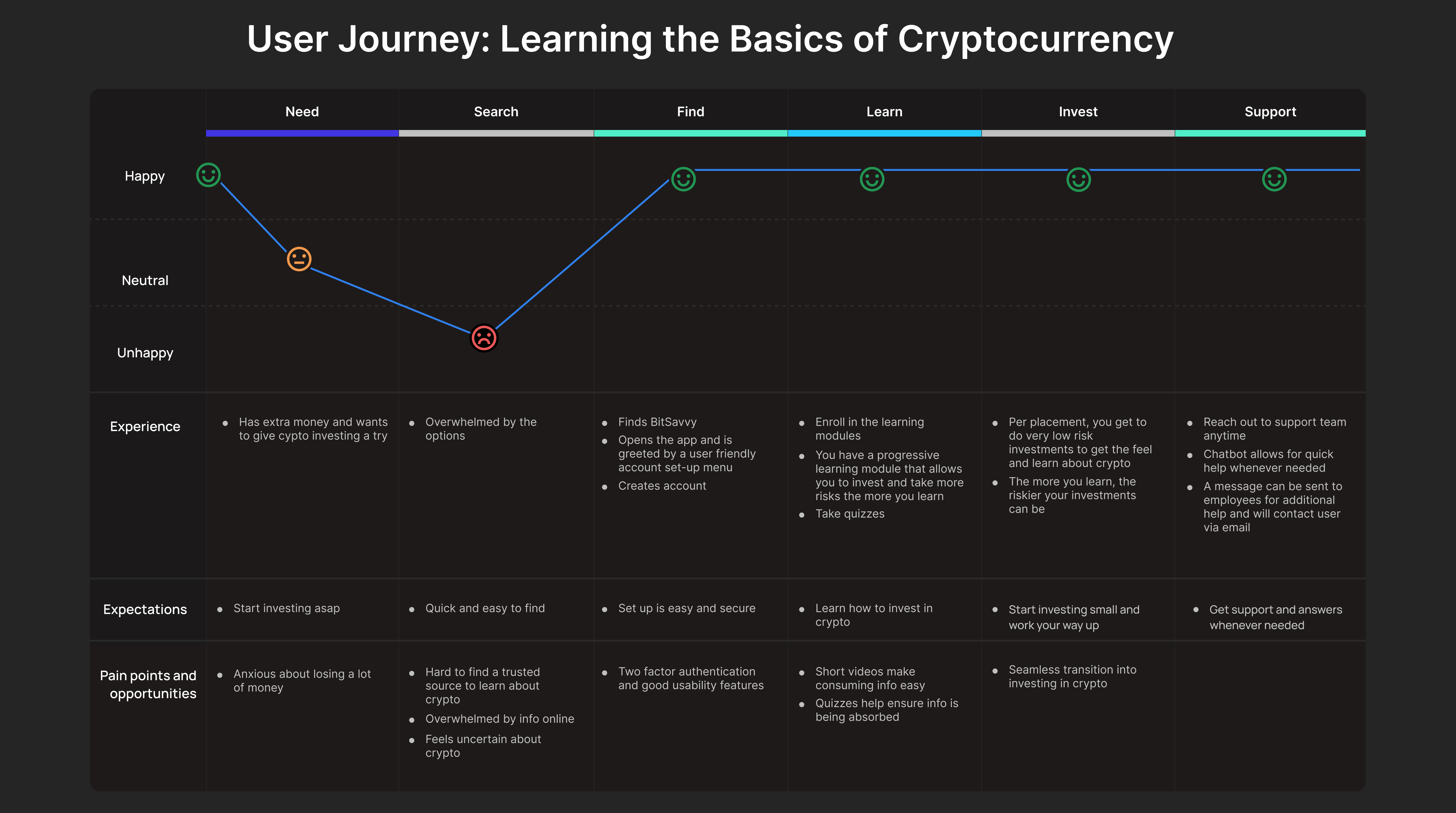
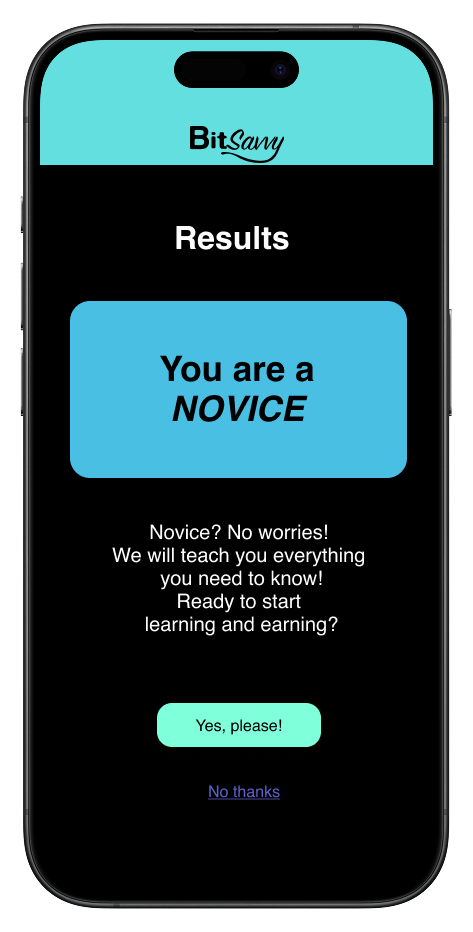
When you first open the app, after making an account, a placement test will appear to determine how much knowledge you have of crypto. That test will determine your learning modules and will allow you to invest money within your knowledge bracket.
I created wireframes of the main pages for the app's progression. This includes: The placement test page, account settings, support, learning module page, homepage, and transactions.
The crypto apps from the analysis were fairly minimal in design, which seems to work. I wanted this app to have a minimal feel, not overwhelming, so that users like Joe and Sonya can feel confident in their ability to invest in crypto.

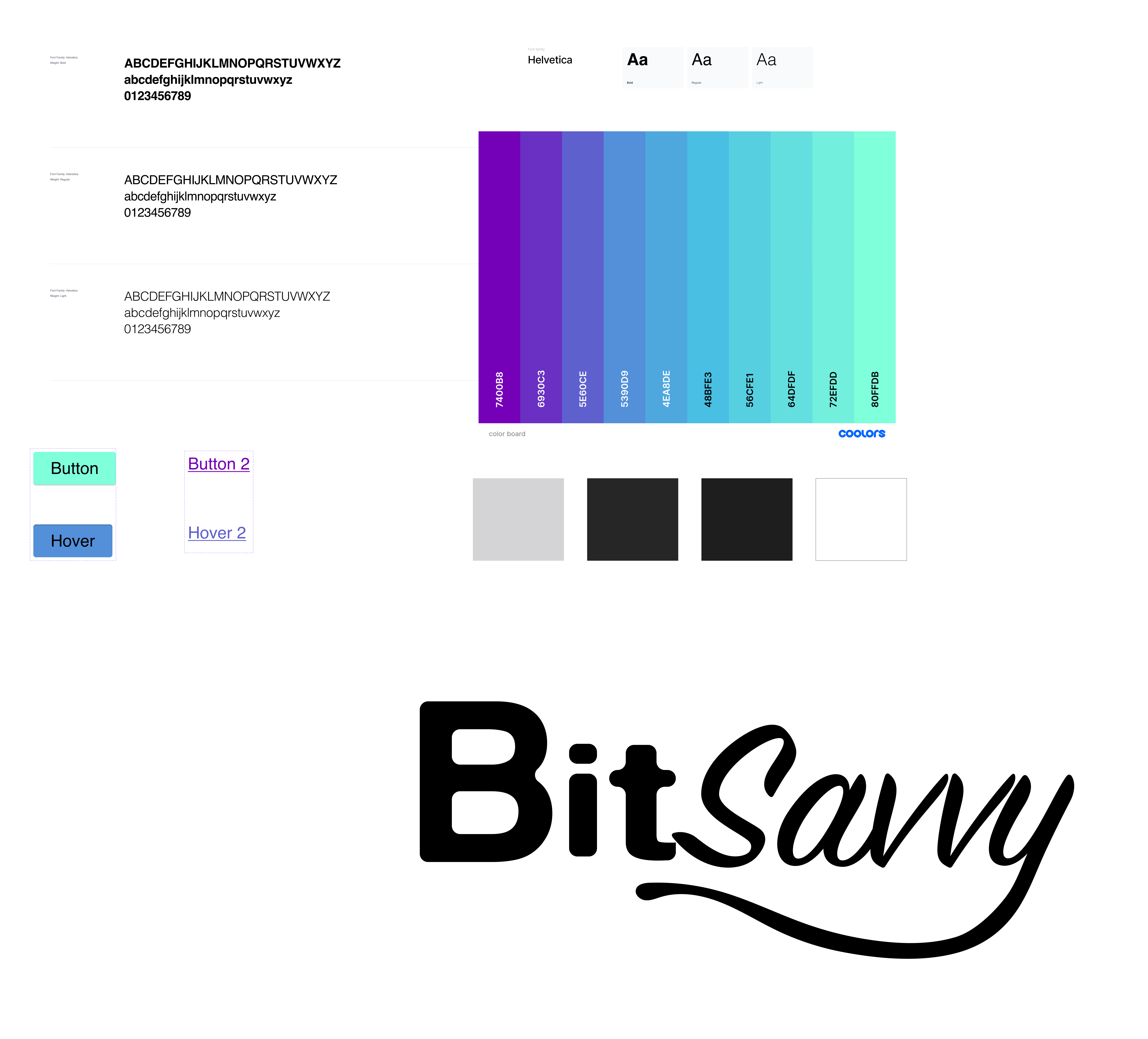
The style decisions for BitSavvy were very simple. I drew inspiration from the popular crypto apps above to establish a sense of familiarity amongst users, but while still standing out.
I chose Helvetica as the sole sans serif font for the app. Most of the apps only seemed to have one typeface throughout the app interface.
For the color scheme, I chose a dark background with white font and cool-toned colors to establish trust.
I crated the Logo on Adobe Illustrator, putting a stylized emphasis on the "Savvy" to give a cool modern feel.
With the challenge of using the same typeface throughout, visual hierarchy was crucial in determining where the User's eyes were drawn to first. The bold and larger font establishes headings for the pages.
Main CTA buttons are rounded with a fill color, the lesser buttons are simply underlined making for a clear happy path.
Simple universal icons were implemented (search and notifications) allowing for easy access and visibility. A navigation bar (bottom of the pages) allows users to see which page theyre on by having the icon highlighted in purple.
The learning page offers a simple yet identifiable path, having the completed modules become grayed out while a little person icon sits on the module the user needs to complete next.
This project pushed me out of my comfort zone, diving into the world of crypto with little prior knowledge. It challenged me to think critically about user education and accessibility in an area such as investing. Looking ahead, I'm excited to apply these insights to real-world projects, collaborating with teams to create intuitive and educational user experiences.
While BitSavvy was a conceptual project, it highlighted the importance of user-centric design in complex fields like cryptocurrency. Moving forward, I aim to engage in projects that allow for user testing and iterative design, ensuring that solutions are not only functional but also resonate with users.
